Definition and History
Cubism was a highly influential visual arts style of the 20th century that was created principally by the painters Pablo Picasso and Georges Braque in Paris between 1907 and 1914. The Cubist style emphasized the flat, two-dimensional surface of the picture plane, rejecting the traditional techniques of perspective, foreshortening, modeling, and chiaroscuro and refuting time-honoured theories of art as the imitation of nature. Cubist painters were not bound to copying form, texture, colour, and space; instead, they presented a new reality in paintings that depicted radically fragmented objects, whose several sides were seen simultaneously. Typical cubist paintings frequently show letters, musical instruments, bottles, pitchers, glasses, newspapers, still lifes, and the human face and figure.
Cubism derived its name from remarks that were made by the painter Henri Matisse and the critic Louis Vauxcelles, who derisively described Braque's 1908 work "Houses at L'Estaque" as composed of cubes. In Braque's work, the volumes of the houses, the cylindrical forms of the trees, and the tan-and-green colour scheme are reminiscent of Paul Cézanne's landscapes, which deeply inspired the Cubists in their first stage of development, until 1909. It was "Les Demoiselles d'Avignon", a work painted by Picasso in 1907, that forecast the new style; in this work, the forms of five female nudes became fractured, angular shapes. As in Cézanne's art, perspective was rendered by means of colour, the warm reddish browns advancing and the cool blues receding.
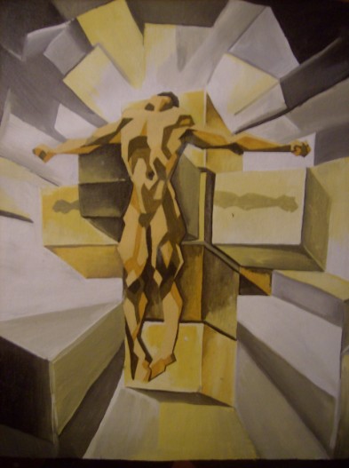
My second cubism painting is titled, “Risen”, created May 2010 using acrylic paint. It displays the image of a male figure on a cross with light shining from behind. The background shows various cubes pointing in various positions which are all conjoined by the fading of colours and shades. The dominant colour is yellow and the piece is monochromatic.
Analysis
The elements and principles of art were used to create the images in this cubism painting. The light yellow gives a relaxing feel. Other hues of yellow are individually used to create the illusion of three dimensions. White is used to portray a shining light while dark brown portrays darkness and shadows. Cubes are the dominant shapes and are used to create the form of the human figure, the cross and the cubes in the background. Straight, angular and zig- zag lines are used to create the abstract form of the human figure, the cross and the cubes in the background. There is only one texture present in the art piece as all the objects appear to be smooth.
A location type of focal point is created by placing the subject in the center of the painting resulting in the viewer automatically looking at that area first. It is also created with the use of stronger hues of yellow for the subject and lighter hues of yellow for the background. Proper balance is created by the straight upright position of the human figure and the cross and is contrasting to the slanted cubes in the background which creates movement.
Problems Encountered
There were several problems which I encountered while doing this art piece. One of these problems is the shading of the colours and shaded of several cubes to make them appear conjoined. Another problem was to design a human figure using only cubic shapes. The management of the brush was also a difficult but learning process for me as I discovered how to shade smoothly with paint by swiftly moving the bristle of the brush from sided o side by raising it gradually of the paper as well as acknowledging the amounts of paint and water added to the bristle. The mixing of various hues also posed a challenge as some times it is difficult to mix the exact hue if it was not originally applied in all necessary areas at first.
My first cubism painting is titled,
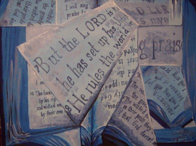
“Bibangles” which is a word created by fusing the words bible and angles,
created April 2010 using tempera and water paint. It displays images of pieces
of the bible in various cubic shapes. The colour blue and its hues are used to
portray a monochromatic image. Analysis The painting was done by using the
elements of art as a tool for producing images. The lightest hues of blue were
used for pages while the darker hues of blue were used for the book cover the
negative space, shadows and texts. The blue gives the painting a subtle look.
Several cube like shapes were composed with each showing a section of the bible
from various angle. Lines were use to create shape and plays a dominant role in
giving a cubic look to the painting. The open pages are bright as they are
coloured in light hues of blue while the shadows, bible cover and folds are
portrayed using darker hues of blue. The over all mood of the work is calm as
the colour blue affects the viewers’ emotions. Interpretation The use of only one object, the
bible, creates simplicity. The bible itself is the subject because of its
importance in the religious world. The chapter, Psalms 7- 9, was chosen based
on the message displayed in the content. Blue my colour of choice because of
its universally recognize symbolism for peace. Problems
Encountered I encountered a several problems
during the process of completing this painting. The actual words and sentences
were confusing when trying to view the same two opened pages from different angles
for all the cubic shapes. I had to take into consideration what area of the
page is within each cubic shape and its angle and size. Another problem was
mixing the same hues on multiple occasions which resulted in getting a slightly
lighter or darker hue than the original. Another problem was getting the
texture of the paper by mixing colours. This was done by choosing limited
variations of hues and making sure they were close in tone.
All images © 2013 Nicholas Barrett
